Design isn’t just about how something looks, it’s about how it works and feels. Behind every stunning app interface, eye-catching poster, or calming website is a set of timeless principles that make it function. These principles aren’t rules set in stone, but guides that help you communicate clearly and beautifully.
Imagine walking into a room where all the furniture is pushed to one side. Uncomfortable, right? That’s what unbalanced design feels like.
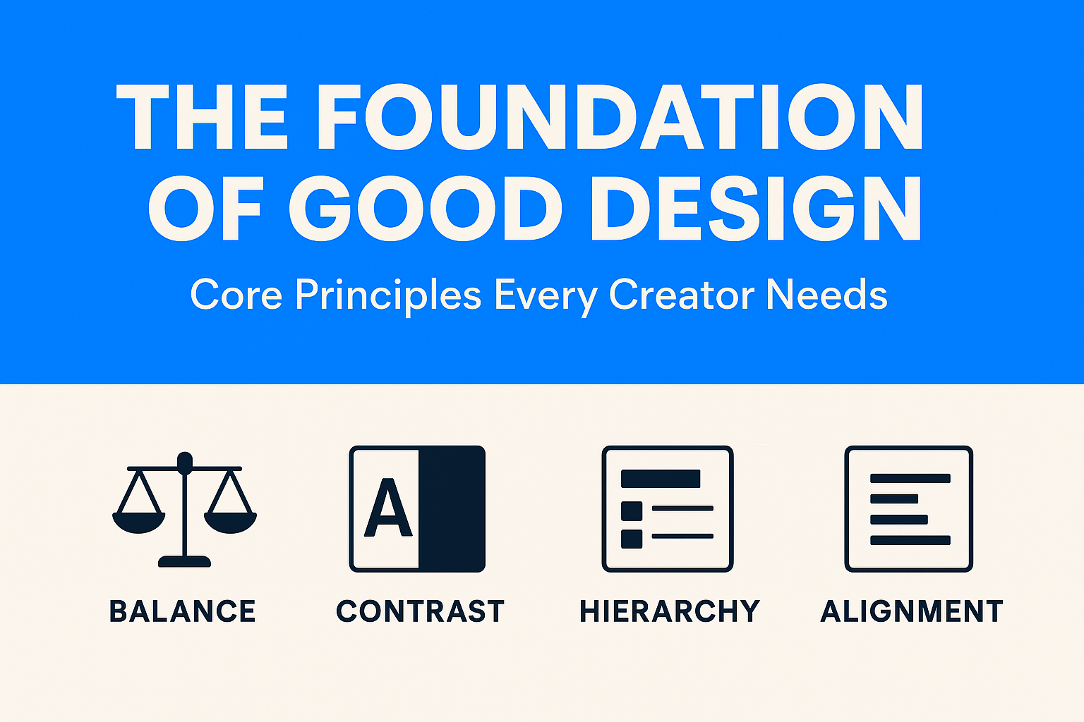
Balance doesn’t mean making things equal; it’s about making them feel stable.
Without contrast, designs are dull. Contrast ensures the important things pop.
You must have heard of Spotify –
When you think of Spotify, chances are you picture its bold neon green on a deep black background. That isn’t an accident, it’s contrast at work. The dark interface reduces eye strain (important for long browsing or late-night listening), while the electric green pops off the screen to guide you toward key actions like “Play,” “Shuffle,” or “Follow.”

Spotify’s designers know that users often multitask, scrolling quickly through playlists or browsing while chatting. High-contrast design ensures the most important elements stand out at a glance, so the user never feels lost.
Ever skimmed a webpage and instantly knew where to look? That’s hierarchy in action.
Hierarchy is visual storytelling, it makes sure your viewer takes the same journey you intended.
Good alignment is like a well-tuned orchestra: you may not notice it when it’s perfect, but you’ll definitely notice when it’s off.
Let’s talk about Google –
Google faced a massive challenge: how do you create consistency across thousands of Android apps made by different developers? The answer was Material Design, a design system built on invisible grids, strict alignment rules, and consistent spacing.
Even if you switch between Gmail, Google Maps, and Google Drive, everything feels familiar, buttons align predictably, menus sit where you expect, and typography follows the same baseline grid. That sense of order isn’t coincidence, it’s alignment making a chaotic ecosystem feel harmonious.
Balance, contrast, hierarchy, and alignment are the backbone of good design. They turn chaos into clarity and ideas into experiences.
In Part 2, we’ll go deeper, exploring the subtle but powerful principles that give designs rhythm, elegance, and personality.
Business Solution
What Is Financial Leakage in Ecommerce? Financial leakage refers to unintended loss of revenue or profit, money that should be in your bank account but isn’t. In high-volume e-commerce, leakage comes in dozens of forms: Manual entry errors in order...
 March 17, 2026
 Adarsh Singh
Uncategorized
At first glance, paper-based processes seem harmless. A few files here, some registers there, spreadsheets printed and signed, it feels familiar, affordable, and “good enough.”But beneath this comfort lies a growing, invisible cost that quietly slows your business down. If...
January 14, 2026
Abhijay Kishore
Case Study
Client Overview Our client is a property investment and resale company that acquires residential properties, enhances their value, and sells them in the open market. Their business relies on accurate purchase price estimation to ensure strong margins and faster decision-making....
January 09, 2026
Abhijay Kishore
Case Study
Most businesses don’t fail because they lack software. They fail because the software they use stops fitting their reality. This is a short case study about Tixverse, an event ticketing platform, and how a seemingly small feature gap became a...
December 25, 2025
Anshuman Chhapolia
UX Design
Most step counters tell you how much you walked.Very few tell you how consistently you walked. That’s where this new step-tracking calendar changes the entire experience. It doesn’t just measure your movement.It visualizes your discipline. With a simple grid of...
November 18, 2025
Abhijay Kishore