Once you understand the core principles, the next step is adding layers that make your design memorable. These principles don’t just make things look better, they make them feel alive.
Proximity is about spacing. Items close together feel connected; items spaced apart feel unrelated.
On e-commerce sites, product images, titles, prices, and “Add to Cart” buttons are grouped. Without proximity, the page would feel messy and confusing.
Consistency breeds trust. When buttons look the same across a site, users feel confident.
Let’s looks at Airbnb –
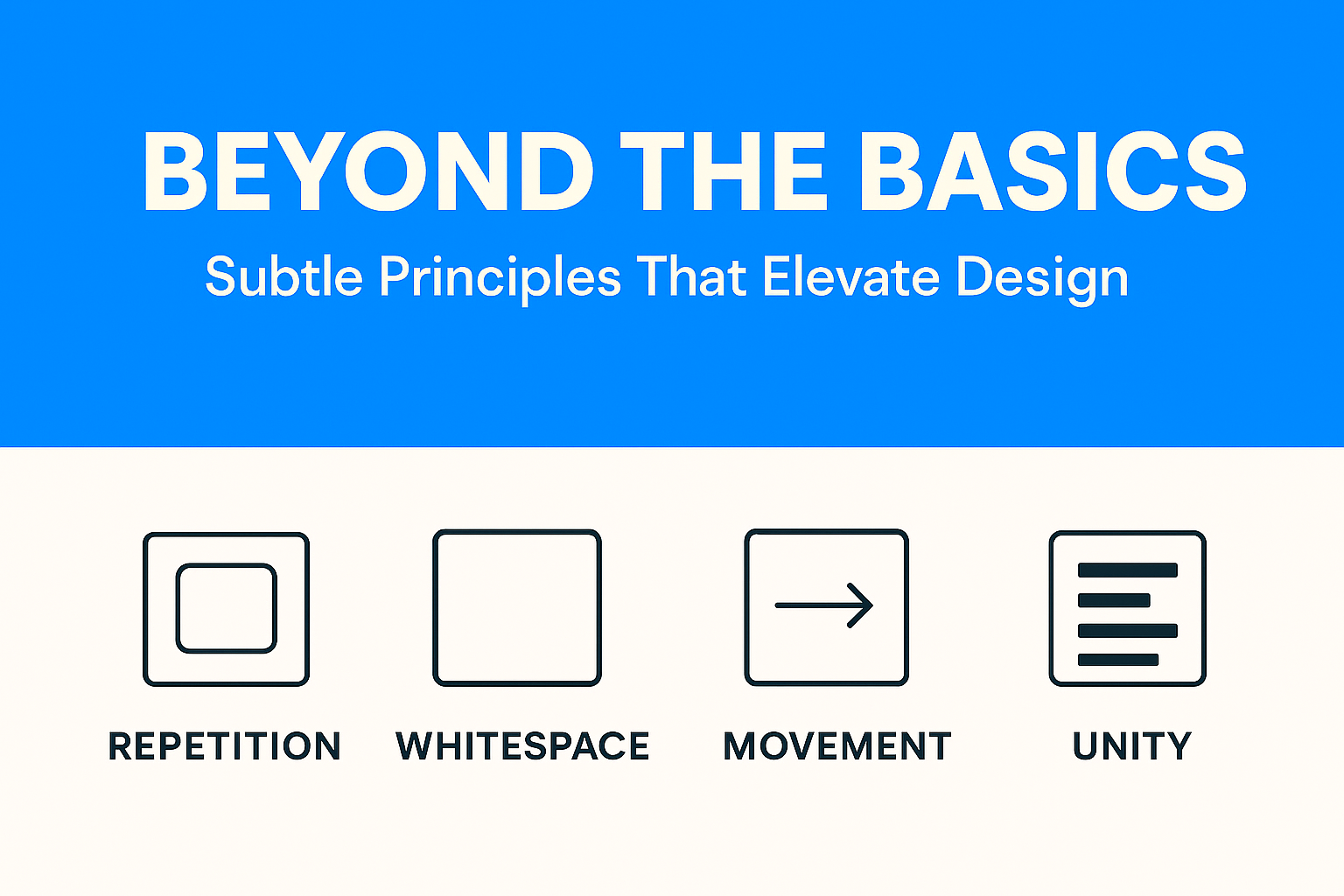
Airbnb’s design language is a great example of how repetition builds trust. Notice how almost every UI element, from images to cards to buttons, uses rounded corners. This repetition creates a subconscious feeling of friendliness and safety, which aligns with Airbnb’s mission: helping strangers feel at home.

Beyond corners, Airbnb repeats its color scheme (red accents on a clean white background) and typography across its app and website. Users might not consciously notice it, but this repetition means they instantly recognize they’re “in Airbnb’s world” no matter what screen they’re on.
Whitespace isn’t “wasted space.” It gives breathing room.
Apple’s website is often studied in design classrooms, and for good reason. Go to a product page like the iPhone or MacBook and you’ll notice one thing: space. Huge margins surround the product photos, text descriptions are minimal, and elements never feel crammed together.
This generous white space does two things:

By contrast, budget e-commerce sites often cram products, prices, and discounts into every inch of the screen. That density might scream “value,” but Apple’s whitespace whispers “premium.”
Unity is when all pieces look like they belong together. Fonts, imagery, icons, and colors should sing in the same tone.
Movement directs how viewers scan a page—even without animation.
Movement doesn’t always mean animation, it’s how the eye flows across a design. Instagram Stories is a perfect example. The circular profile icons at the top of the app nudge users to tap. Once inside a Story, progress bars at the top create a natural rhythm, guiding your eyes from left to right.
Even without swiping, you feel the flow. Subtle motion encourages you to keep going, tap the next story, swipe to the next person, and stay engaged. That’s movement as a design principle, nudging user behavior through rhythm and flow.
When you layer proximity, repetition, whitespace, unity, and movement onto the basics, your designs transform from functional to unforgettable. It’s not just about looking good, it’s about feeling right.
Business Solution
What Is Financial Leakage in Ecommerce? Financial leakage refers to unintended loss of revenue or profit, money that should be in your bank account but isn’t. In high-volume e-commerce, leakage comes in dozens of forms: Manual entry errors in order...
 March 17, 2026
 Adarsh Singh
Uncategorized
At first glance, paper-based processes seem harmless. A few files here, some registers there, spreadsheets printed and signed, it feels familiar, affordable, and “good enough.”But beneath this comfort lies a growing, invisible cost that quietly slows your business down. If...
January 14, 2026
Abhijay Kishore
Case Study
Client Overview Our client is a property investment and resale company that acquires residential properties, enhances their value, and sells them in the open market. Their business relies on accurate purchase price estimation to ensure strong margins and faster decision-making....
January 09, 2026
Abhijay Kishore
Case Study
Most businesses don’t fail because they lack software. They fail because the software they use stops fitting their reality. This is a short case study about Tixverse, an event ticketing platform, and how a seemingly small feature gap became a...
December 25, 2025
Anshuman Chhapolia
UX Design
Most step counters tell you how much you walked.Very few tell you how consistently you walked. That’s where this new step-tracking calendar changes the entire experience. It doesn’t just measure your movement.It visualizes your discipline. With a simple grid of...
November 18, 2025
Abhijay Kishore