Once you understand the core principles, the next step is adding layers that make your design memorable. These principles don’t just make things look better, they make them feel alive.
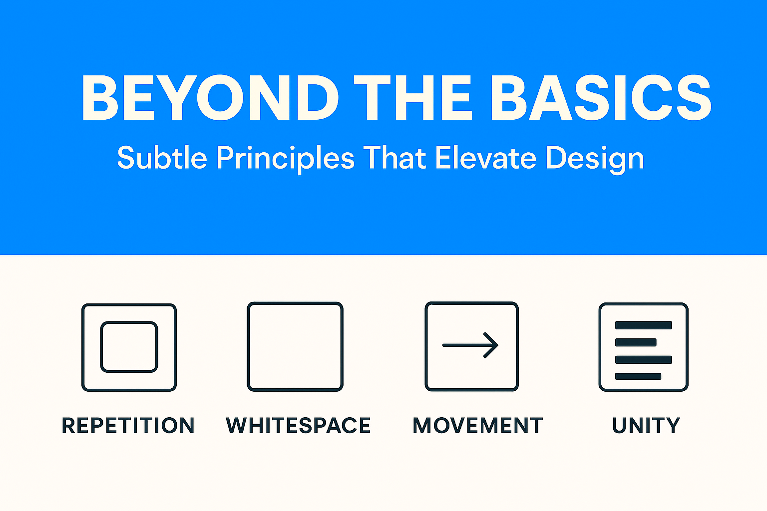
Proximity is about spacing. Items close together feel connected; items spaced apart feel unrelated.
On e-commerce sites, product images, titles, prices, and “Add to Cart” buttons are grouped. Without proximity, the page would feel messy and confusing.
Consistency breeds trust. When buttons look the same across a site, users feel confident.
Let’s looks at Airbnb –
Airbnb’s design language is a great example of how repetition builds trust. Notice how almost every UI element, from images to cards to buttons, uses rounded corners. This repetition creates a subconscious feeling of friendliness and safety, which aligns with Airbnb’s mission: helping strangers feel at home.

Beyond corners, Airbnb repeats its color scheme (red accents on a clean white background) and typography across its app and website. Users might not consciously notice it, but this repetition means they instantly recognize they’re “in Airbnb’s world” no matter what screen they’re on.
Whitespace isn’t “wasted space.” It gives breathing room.
Apple’s website is often studied in design classrooms, and for good reason. Go to a product page like the iPhone or MacBook and you’ll notice one thing: space. Huge margins surround the product photos, text descriptions are minimal, and elements never feel crammed together.
This generous white space does two things:

By contrast, budget e-commerce sites often cram products, prices, and discounts into every inch of the screen. That density might scream “value,” but Apple’s whitespace whispers “premium.”
Unity is when all pieces look like they belong together. Fonts, imagery, icons, and colors should sing in the same tone.
Movement directs how viewers scan a page—even without animation.
Movement doesn’t always mean animation, it’s how the eye flows across a design. Instagram Stories is a perfect example. The circular profile icons at the top of the app nudge users to tap. Once inside a Story, progress bars at the top create a natural rhythm, guiding your eyes from left to right.
Even without swiping, you feel the flow. Subtle motion encourages you to keep going, tap the next story, swipe to the next person, and stay engaged. That’s movement as a design principle, nudging user behavior through rhythm and flow.
When you layer proximity, repetition, whitespace, unity, and movement onto the basics, your designs transform from functional to unforgettable. It’s not just about looking good, it’s about feeling right.
Business Solution
Your Business Looks Profitable. But Is It? Here’s a scenario that plays out in boardrooms every quarter: the CFO presents a healthy blended margin. Revenue is up. Leadership signs off on a new product launch. Three months later, cash flow...
 April 29, 2026
 Adarsh Singh
Business Solution
For Indian manufacturing founders and CFOs navigating their next operational upgrade. The Tally vs ERP question for manufacturers is ultimately not about software preference, it is about operational maturity. There is a specific kind of Friday evening that every manufacturing...
April 22, 2026
Abhijay Kishore
Business Solution
Your Heading How we replaced a broken Excel-based commission process with a SQL-powered automation engine — cutting a 24-hour monthly cycle down to 8 hours. Every month, a team of finance specialists sat down with a sprawling Excel workbook. Their...
April 14, 2026
Anshuman Chhapolia
Business Solution
Every ecommerce finance team has lived this moment: the monthly close is approaching, your payment gateway shows one number, QuickBooks shows another, and the affiliate dashboard appears to be operating in a separate dimension entirely. You reconcile for hours, patch...
April 08, 2026
Adarsh Singh
Business Solution
You’re running a manufacturing business that’s doing well. Somewhere between ₹20 crore and ₹100 crore in annual revenue. You have a plant, a team, orders coming in, and real customers who depend on you. And yet, every week, something surprises...
April 01, 2026
Anshuman Chhapolia