Design isn’t just about how something looks, it’s about how it works and feels. Behind every stunning app interface, eye-catching poster, or calming website is a set of timeless principles that make it function. These principles aren’t rules set in stone, but guides that help you communicate clearly and beautifully.
Imagine walking into a room where all the furniture is pushed to one side. Uncomfortable, right? That’s what unbalanced design feels like.
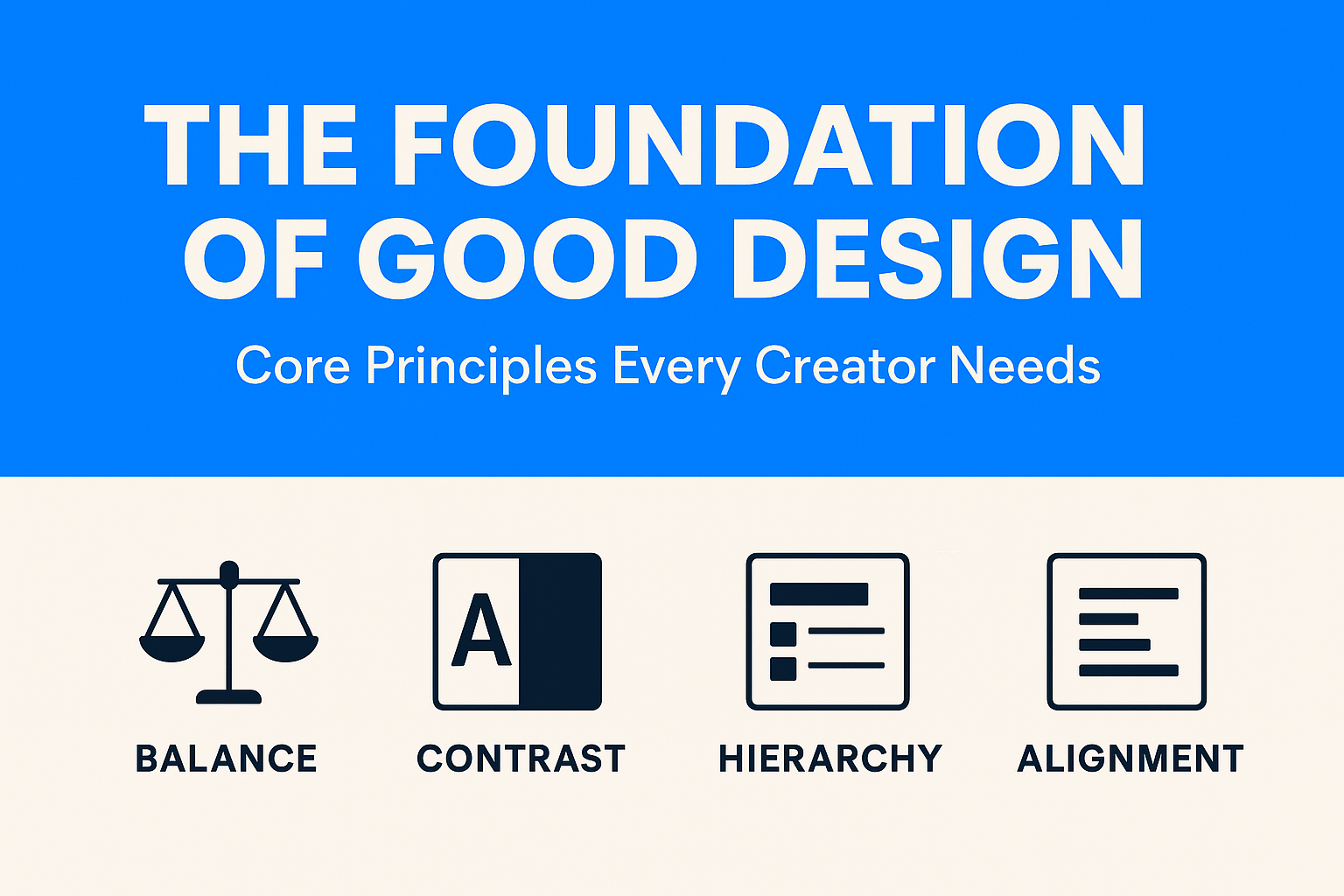
Balance doesn’t mean making things equal; it’s about making them feel stable.
Without contrast, designs are dull. Contrast ensures the important things pop.
You must have heard of Spotify –
When you think of Spotify, chances are you picture its bold neon green on a deep black background. That isn’t an accident, it’s contrast at work. The dark interface reduces eye strain (important for long browsing or late-night listening), while the electric green pops off the screen to guide you toward key actions like “Play,” “Shuffle,” or “Follow.”

Spotify’s designers know that users often multitask, scrolling quickly through playlists or browsing while chatting. High-contrast design ensures the most important elements stand out at a glance, so the user never feels lost.
Ever skimmed a webpage and instantly knew where to look? That’s hierarchy in action.
Hierarchy is visual storytelling, it makes sure your viewer takes the same journey you intended.
Good alignment is like a well-tuned orchestra: you may not notice it when it’s perfect, but you’ll definitely notice when it’s off.
Let’s talk about Google –
Google faced a massive challenge: how do you create consistency across thousands of Android apps made by different developers? The answer was Material Design, a design system built on invisible grids, strict alignment rules, and consistent spacing.
Even if you switch between Gmail, Google Maps, and Google Drive, everything feels familiar, buttons align predictably, menus sit where you expect, and typography follows the same baseline grid. That sense of order isn’t coincidence, it’s alignment making a chaotic ecosystem feel harmonious.
Balance, contrast, hierarchy, and alignment are the backbone of good design. They turn chaos into clarity and ideas into experiences.
In Part 2, we’ll go deeper, exploring the subtle but powerful principles that give designs rhythm, elegance, and personality.
Business Solution
Your Business Looks Profitable. But Is It? Here’s a scenario that plays out in boardrooms every quarter: the CFO presents a healthy blended margin. Revenue is up. Leadership signs off on a new product launch. Three months later, cash flow...
 April 29, 2026
 Adarsh Singh
Business Solution
For Indian manufacturing founders and CFOs navigating their next operational upgrade. The Tally vs ERP question for manufacturers is ultimately not about software preference, it is about operational maturity. There is a specific kind of Friday evening that every manufacturing...
April 22, 2026
Abhijay Kishore
Business Solution
Your Heading How we replaced a broken Excel-based commission process with a SQL-powered automation engine — cutting a 24-hour monthly cycle down to 8 hours. Every month, a team of finance specialists sat down with a sprawling Excel workbook. Their...
April 14, 2026
Anshuman Chhapolia
Business Solution
Every ecommerce finance team has lived this moment: the monthly close is approaching, your payment gateway shows one number, QuickBooks shows another, and the affiliate dashboard appears to be operating in a separate dimension entirely. You reconcile for hours, patch...
April 08, 2026
Adarsh Singh
Business Solution
You’re running a manufacturing business that’s doing well. Somewhere between ₹20 crore and ₹100 crore in annual revenue. You have a plant, a team, orders coming in, and real customers who depend on you. And yet, every week, something surprises...
April 01, 2026
Anshuman Chhapolia