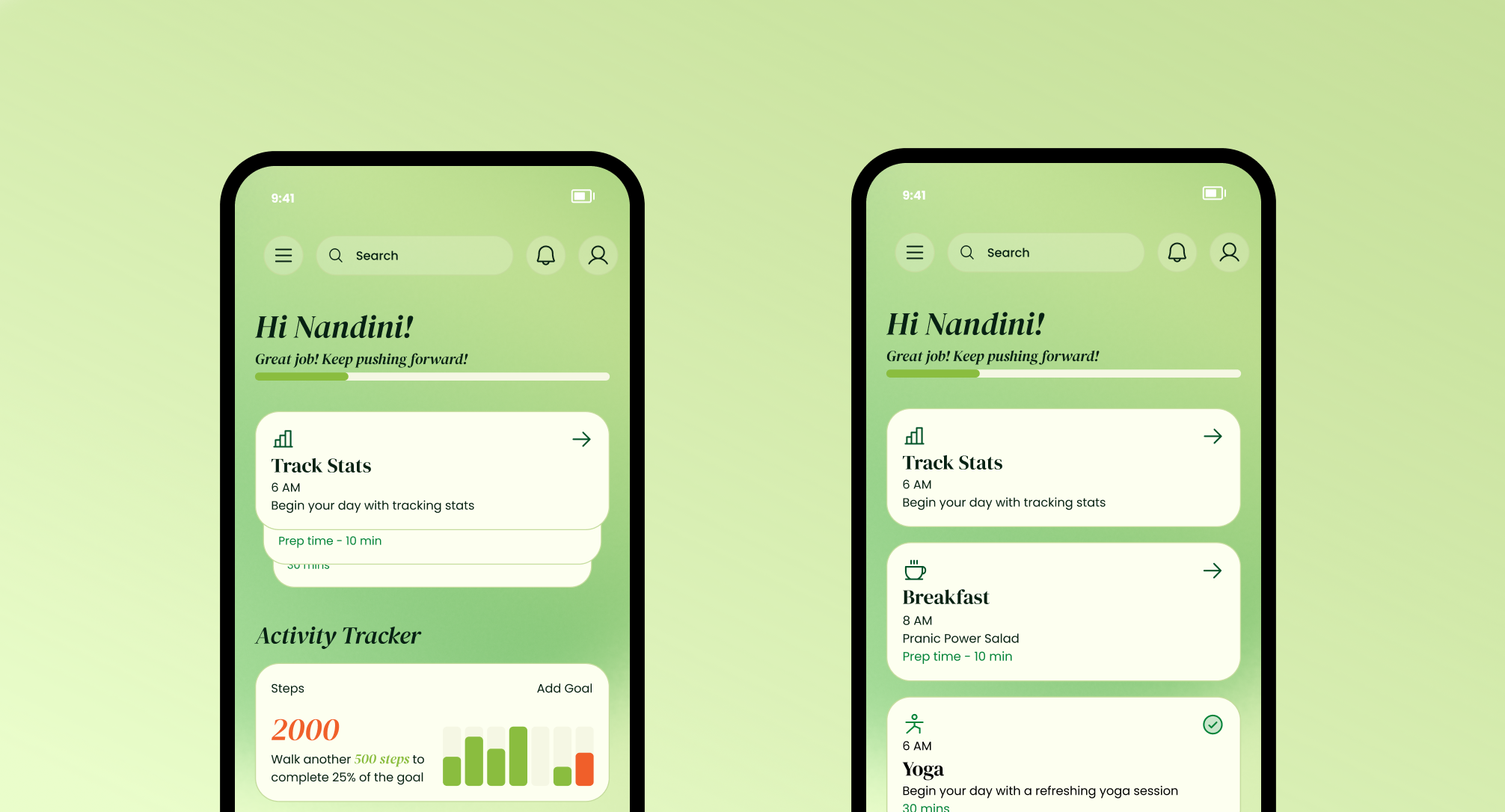
Why Stacked Cards Just Work Better Than Lists for “Next Task” Views

Picture of Abhijay Kishore
Abhijay Kishore

If you’ve ever opened a productivity app and been smacked in the face with a long list of tasks, you know the feeling — overwhelm. Your brain instantly goes, “Ugh… where do I even start?”

That’s where stacked card design comes in.
Instead of showing you everything at once, it says:

“Here’s the next thing you need to do. Focus on this. Don’t worry — I’ve got the rest lined up.”

It’s a small design change, but it can make a huge difference in how people interact with your app. Let’s talk about why.

1. It Puts the Spotlight on What Matters Now

The beauty of stacked cards is that the top card is the star of the show. It’s bigger, bolder, and right there in your face. That’s the task you should be focusing on right now.

In a list, every task looks equally important — which means nothing actually feels important.

With stacked cards: you always know exactly where to start.

2. It Feels Like a Natural Flow

There’s something satisfying about tackling one card at a time, watching the next one slide up into place. It’s almost like flipping through a deck of cards — you finish one, you’re curious about the next.

This works especially well for routines or guided flows, like:


    • Morning rituals

    • Fitness programs

    • Step-by-step onboarding

A long list doesn’t give you that sense of rhythm. You’re more likely to jump around or feel guilty for skipping things.

3. Clean, Compact, and Mobile-Friendly

Let’s be real — on mobile, space is gold. Stacked cards let you show what’s important now, while still teasing what’s coming next. No endless scrolling. No clutter.

It’s like having a personal assistant whisper, “Here’s what’s next… but no rush.”

4. Makes Progress Feel Good

Every time you clear a card and the next one slides up, it’s a mini win.
That little movement can trigger a nice hit of dopamine, making you feel like you’re actually getting somewhere.

It’s a subtle form of gamification, and it works.

5. Just Looks and Feels Better

Flat lists? Functional, sure. Exciting? Not really.
Stacked cards? They have depth, movement, and personality. They feel more interactive — like something you want to play with.

When to Stack vs. When to List

Go Stacked When… Go List When…
Tasks should be done in order Tasks are independent
You want to guide the user’s flow You want the user to pick freely
You’re designing for mobile You have space and need full visibility
You want a modern, dynamic feel You want plain, scannable simplicity

Wrapping It Up

If your app is all about guiding someone through their day, stacked cards are your friend. They help people focus on the now, keep things simple, and make progress feel fun.

Think of it like this — instead of dumping the whole to-do list on the table, you’re handing people one card at a time, with a wink that says:
“Don’t worry, I’ve got the rest covered.”

Recent Articles

Apple Wallet Integration with Node.js and pkpass
How We Reduced Event Entry Wait Times with Apple Wallet Integration
Advanced Full-Text Search in PostgreSQL: Beyond Simple Pattern Matching

More Articles in UX Design